


Aurelia Atelier
I wanted the website to feel like the restaurant: warm, personal, and easy to settle into.
- Project
- Fictional restaurant concept
- The work
- Design, development and motion
- Built with
- Next.js, React and TypeScript
Try the website
Scroll inside the preview. Open the menu, browse the dishes or try the reservation demo.
What I had in mind
Aurelia is a fictional restaurant concept I used to explore how a dining experience could translate to a website. I wanted someone to get a feel for the place, see what’s on the menu, and find their way to a reservation without having to hunt.
The food and the people needed to come first. The design gives them room, with a clear path through the restaurant, menu, chef and private-dining pages.
Why these colors
I chose warm ivory because I wanted something softer than a bright white screen. Against the food photography, it feels closer to paper—a good fit for reading a menu.
The dark backgrounds give the evening photographs space and keep the focus on the table. Orange comes from the warmth of the kitchen and the fire in the opening. I used it sparingly, especially on actions like reserving a table, so it has a job to do.
A menu you can read
The menu is one of the main reasons someone visits a restaurant website. I treated it like a printed menu: two balanced columns, clear dish names, ingredients underneath and individual prices beside each dish. The five-course option stays visible, alongside à la carte choices.
A seven-section index lets you jump to starters, fish, mains, sides, dessert or wine without scrolling through everything. I kept the prices in one content file so they can be updated consistently. The small infinity signature is a single-line SVG, so it stays crisp without another image file. I chose Bigilla for the larger titles because it has character. EB Garamond gives the menu and editorial sections a quieter voice. Navigation and buttons use a simpler typeface so the practical parts stay easy to read.
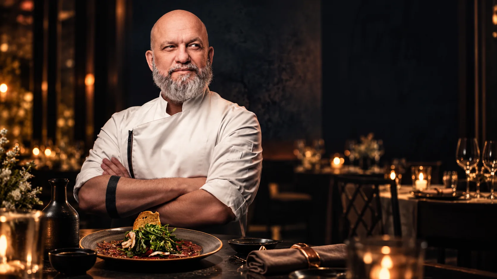
Homepage photography
The main photograph gives the homepage a clear focal point.
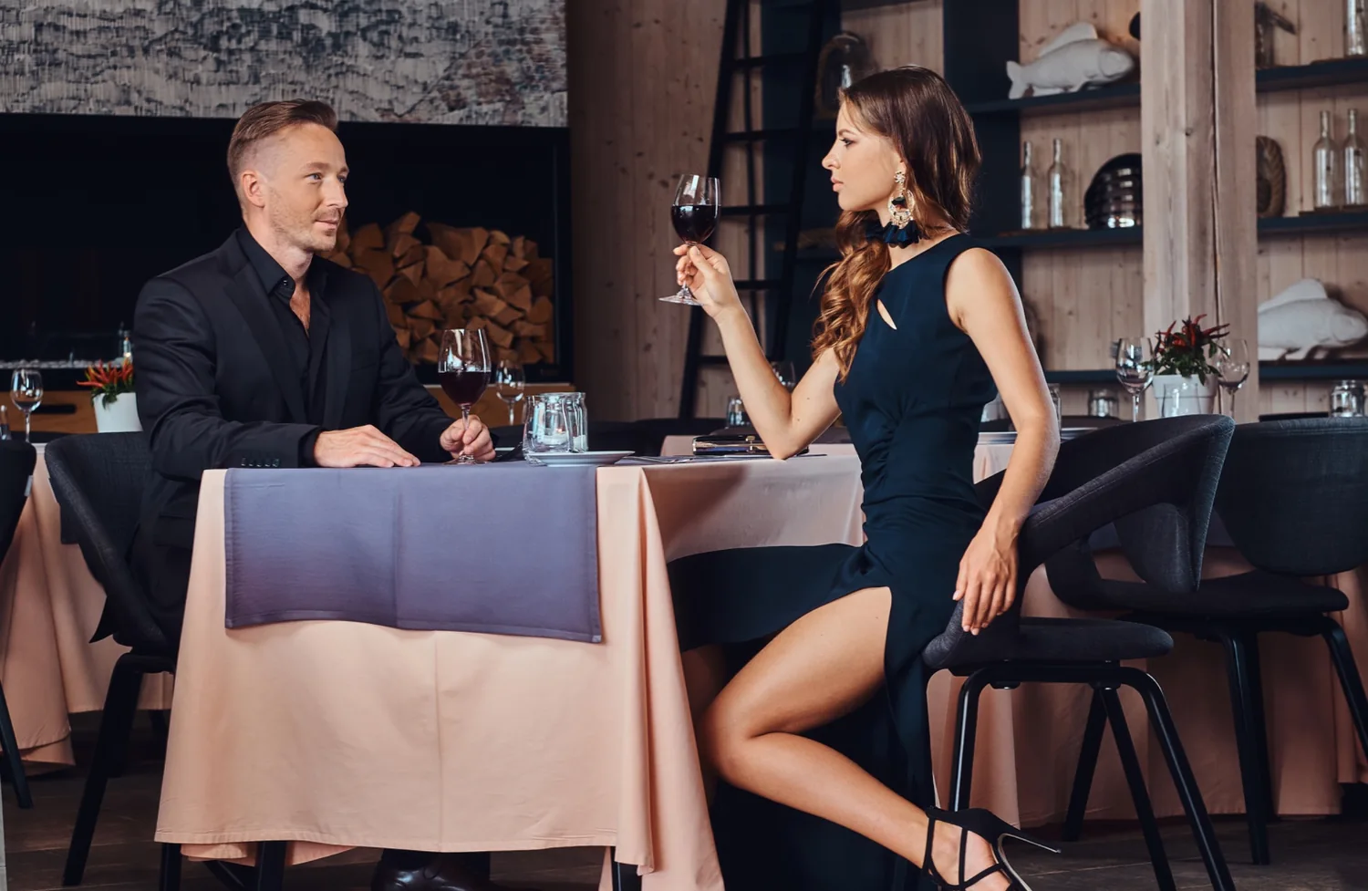
The dining room
Restaurant pages introduce the space and the dining experience.
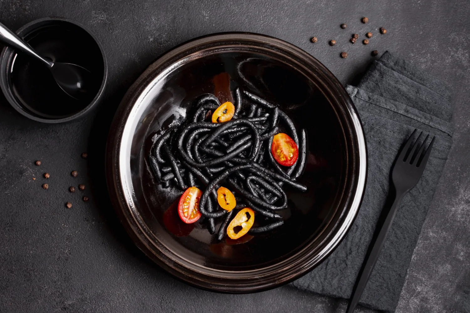
The menu
Course names and descriptions use a simpler reading layout.
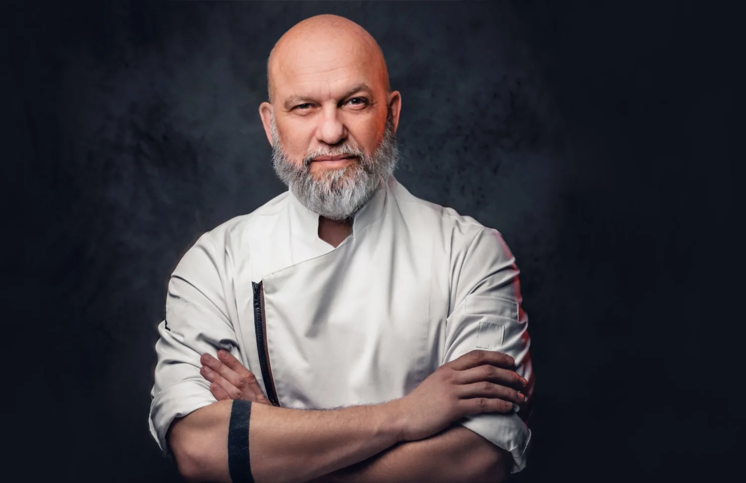
The chef
The chef page and journal give visitors more to explore.
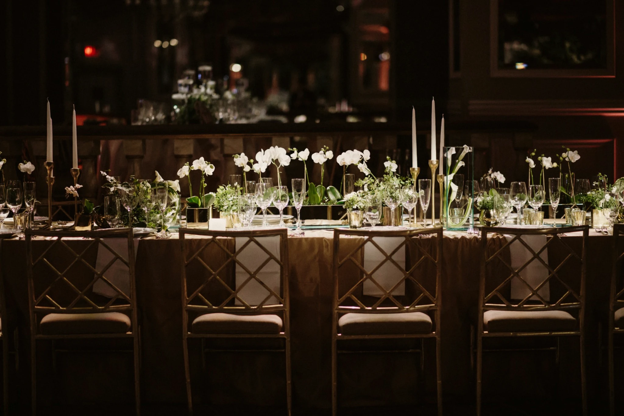
Private dining
Private dining and a reservation demo sit alongside the restaurant pages.
Booking shouldn’t be a chore
Trying to book dinner can get messy. You’re sent to another site, asked to search again, and left wondering what the table or time actually means. I wanted the reservation flow to feel like part of Aurelia, so I created a custom one.
You choose a date, party size and arrival time, then pick a table preference on a floor plan. The plan shows the counter, terrace and main room. Changing your search updates which sample tables fit, and clears a previous choice if it no longer works.
Guest details come next, with space for an occasion, dietary requirements and accessibility notes. A review step brings everything together before the request details can be copied.
This is a working interface demo with sample availability. It doesn’t hold a table or send a reservation. A live version would need a booking backend to manage real availability, prevent double bookings and send confirmations.
Making it work
I built the site with Next.js, React and TypeScript, using shared components so the navigation and layouts stay consistent as you move between pages.
I wanted movement to support the page rather than compete with it. Titles and menu rows appear as you reach them, and the homepage text waits until the opening is finished. Visitors who prefer reduced motion can read the site without those transitions.
The header gets smaller as you scroll, leaving more room for the content. On the visit page, a directions link is always available. The embedded Google map only loads if the visitor allows it.
Details I worked through
Getting the fonts to load
The custom fonts initially needed a path correction. I added a setup step that puts the supplied font files in the right place, so the site can use its intended typography when it’s built.
Coordinating the opening and the page
The opening and the homepage text had to work together. I coordinated their timing and accounted for people returning to a page, so the animation wouldn’t leave a heading hidden.
Keeping maps optional
I kept the map separate from the directions link. That way, someone can get directions without first agreeing to load an embedded service. Their map preference is saved and can be changed later.
About the concept
Aurelia is a design and development study, not an operating restaurant. The reservation flow uses sample availability.
For a real restaurant, the next step would be connecting its booking system, confirming its menu and location details, and completing production testing before launch.