Start a project ↗
← Selected work

Podcast &
broadcast graphics.

The Val Price Show

A little messy.
A lot of personality.

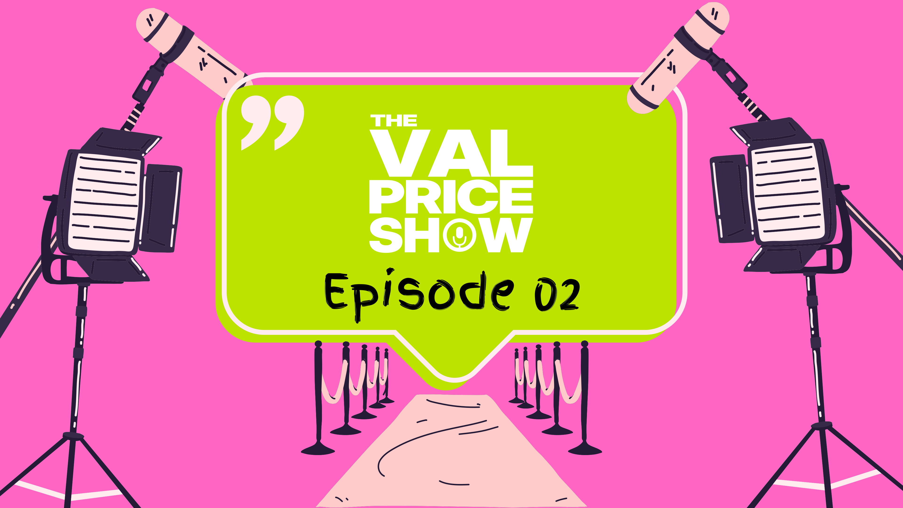
Opening graphic · The Val Price Show

Make it feel
like Val.

I wanted the show to feel like a conversation you would actually want to join. Bright, open and full of personality.

Pink and lime give the opening a playful contrast. The speech bubble makes the idea immediate, while the microphones and studio lights bring the broadcast setting into the artwork.

PinkLimeInk
Leave the
brush marks in.

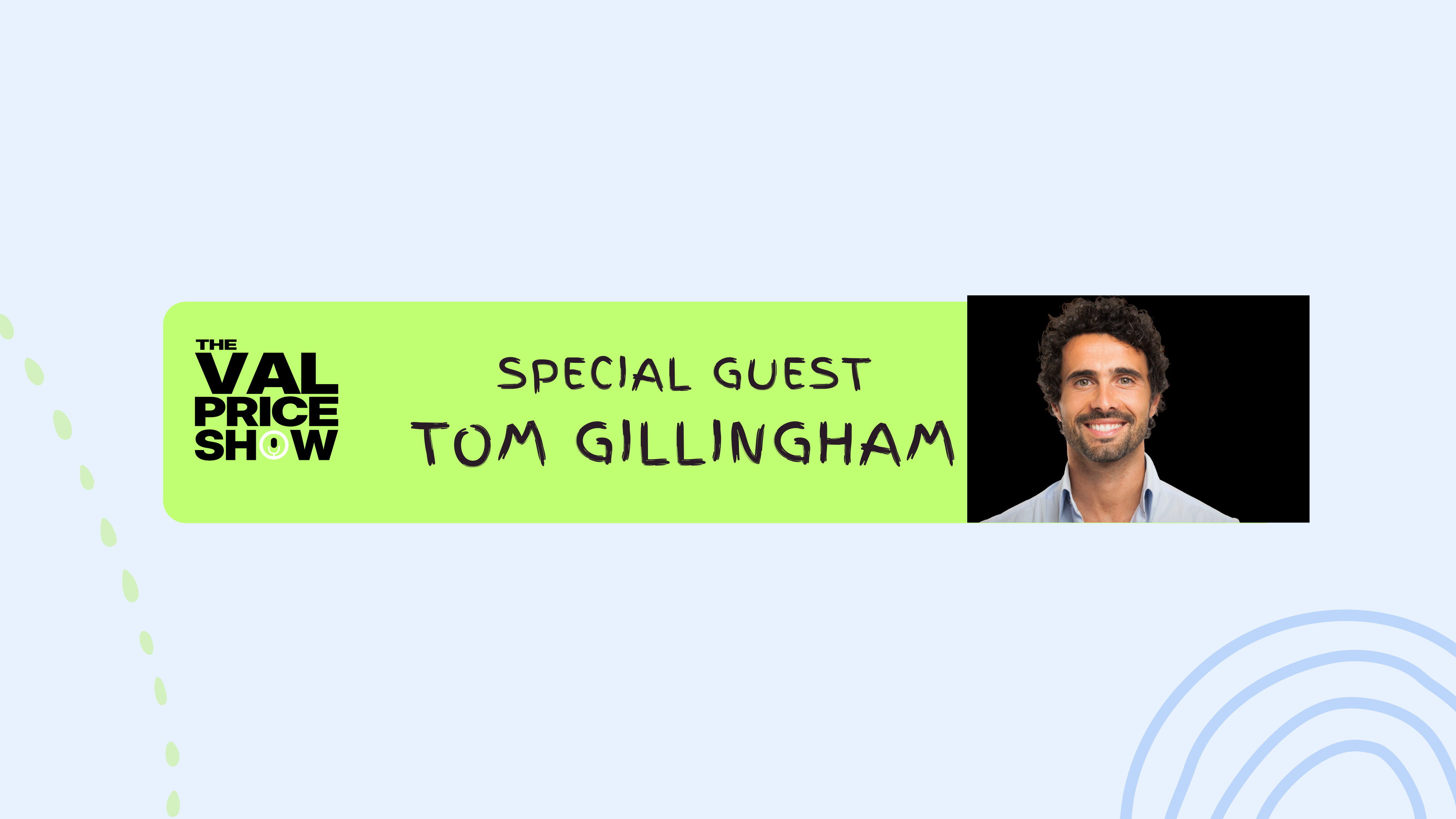
I went with a custom finger-paint style for the expressive lettering. Uneven edges and loose strokes keep it personal. It should feel made by a person, with a little room to play.

The heavier show title gives that loose lettering something solid to sit beside. One carries the name; the other brings the personality.

Original broadcast artwork with expressive lettering
Supplied vector artwork · lettering and composition

Built around
the conversation.

The vector graphics give the package a consistent visual language: microphones, lighting, simple outlines and a clear space for the episode title.

Working in vectors keeps the drawn shapes crisp when the artwork changes size. For playback, the finished motion is delivered as video, so it can sit comfortably in a broadcast or online edit.

The Val Price Show broadcast vector composition
Vector composition · shapes, type and broadcast details

A proper
sign-off.

The closing screen changes pace. Pink moves into blue and violet, the painted lettering returns, and the video spaces give viewers a clear next step.

It belongs to the same show, but gives the episode a distinct ending.

Closing screen · motion example

Have a show
in mind?

Let’s give it a look of its own ↗← Back to all work